Nokia Changes Logo After 60 Years to Mark New Era
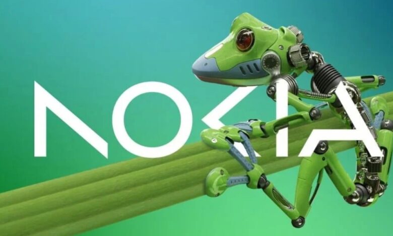
It is true that Nokia has changed its logo for the very first time in its whole history of 60 years. Following Pekka Lundmark’s appointment as CEO of Nokia’s telecom equipment arm, the company devised a strategy that consisted of three stages: reset, accelerate, and scale.
Because the initial phase of the plan has been completed, Nokia will now concentrate on accelerating, and the company will alter its logo for the very first time in order to highlight the shift in approach.
Nokia has decided to remove the blue color from its products and replace it with a shade that is better suited to the current circumstances.
Yet, there isn’t a predetermined color scheme that’s been designated. The word “Nokia” is represented by the new logo, which is comprised of five distinct shapes.
Pekka Lundmark, the CEO of the company, stated that the previous logo caused people to think of smartphones. The new appearance and feel, on the other hand, indicate that Nokia has transitioned into the role of a “business technology company.”
Nokia Changes Logo After 60 Years to Mark New Era
In addition to expanding its business in telecommunications equipment, Nokia plans to place a greater emphasis on the sale of equipment to other companies.
They include private 5G networks and equipment for automated factories, both of which would place the company in a position to compete with Microsoft and Amazon in the relevant market.
Lundmark added that Nokia is considering expanding its operations into other fields in order to develop and grow.


